Excel in the Art of Creepiness
Monsters University, a new Pixar film premiering in June 2013, has launched a website for, well, Monsters University. The site, monstersuniversity.com/edu, deserves an A+ for fun and an A++ for creative execution. It’s a good marketing lesson about how to tell your story using a familiar format to spin out all the creative possibilities, even for those of us who don’t have monsters as clients.
MonstersUniversity.com/edu uses the predictable format and standard branding strategy found on the websites of most universities. The home page features an aspirational slideshow that promises that students will Discover, Explore and Excel. They’ll be discovering “the monster you want to be,” exploring “the illustrious history of an educational power,” and excelling “in the art of extreme creepiness.” Cute, right?
It tells its silly story simply. This digital brochure, including a school store (more on that later), has lots of pull down menus to answer any question a member of the university community may have and loads of copy to pore over. College websites are often copy-rich and photo-light. So even though it’s promoting a movie, there aren’t as many photos as you would expect. Instead, the Monsters University brand is showcased through hyperbole found on a typical university website. All the different target audiences that universities serve are accounted for: prospective students and their parents, current students, faculty and the all-important gift-giving alumni. There’s advice on admissions, financial aid, dining options and how to pay for food, and information on Greek Life. Monster Greeks that is. The site even explains how to donate to the university (in person at the Alumni office just in case you were interested).
The fun is to find the ridiculous in the prosaic. For example, to gain admission to MU, monsters have to take a Monster Aptitude Test. Here’s a sample question from the website:
100 furry sophomores meet for five minutes in the Quad. Four different fur colors are represented. 50% of the students are blue, 30% green, 15% red, and 5% orange. Between the 100 students are 644 arms. Assuming the arms are proportionately distributed, what is the probability that a randomly observed high five will be between a furry green hand and a furry red one?
A. 18%
B. 22%
C. less than 1%
D. 4.5%
E. 13.92%
Did you get it right? Just like the SAT only furrier.
What about community engagement? Conversation? Social media? I have to give the Pixar marketing team an F for now. Monsters University has a Facebook page where nothing much is happening. They last posted July 10. Wikipedia says that the movie was first slated to premiere in November of this year; according to imdb.com that date has been pushed back to June, 2013, which may explain the lack of attention to building a Facebook community right now. If the movie marketers follow through on the same creative strategy they applied to the website, wouldn’t it be a great to host Twitter chats with monster professors, arrange for monster study group pages on Facebook, or post photos on Instagram of Greek Life? What about getting a Monsters University course listed on Coursera?
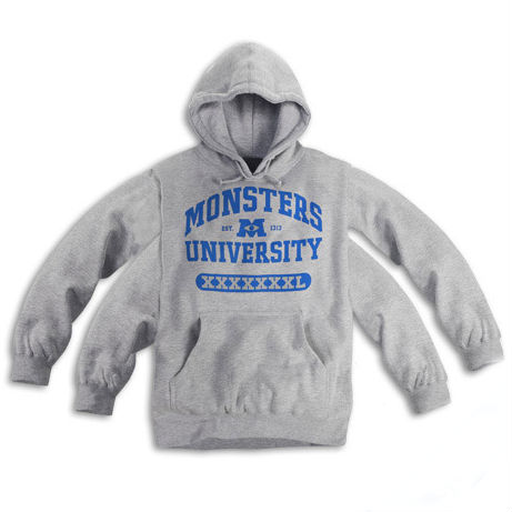
For now, we have the website to dive into, where we can pay a visit to the Monsters University online store to purchase a logoed-hoodie which comes in sizes S to XXXXXXXXL, and with options for 2, 4 or 6 sleeves and 1 or 2 collars. Well, the four-sleeve version is “coming soon,” and the monster in me wants one.
What other brands, events, projects do you think would benefit from this approach? Share your stories here.


